
Origin App
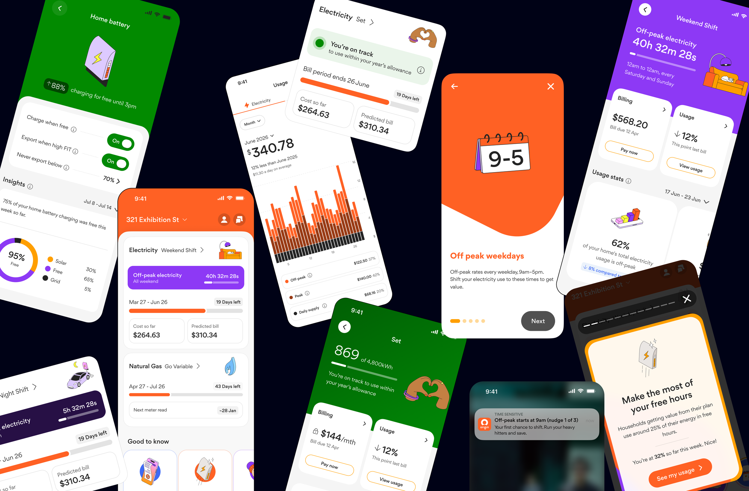
Designing a simpler energy experience for increasingly complex products. As Origin introduced new energy products and plans — from time-of-use and subscription models to battery offerings — the customer experience needed to evolve with them.
MY ROLE
I worked across product, CX and technology teams to shape MVP journeys, define experience principles, and recommend and validate next-steps for the app. I translated these into high-fidelity designs bringing new products and capabilities together in a more connected experience, giving feature teams a clear direction to build on and refine when prioritised.
PRODUCTS
Time-of-use
Subscription
Battery
Future energy experiences
SCOPE
Product strategy
UX
Interaction design
Prototyping
Research
Design direction
The Challenge
How do you make increasingly complex energy products feel simple?
As Origin introduced new energy products, customers faced more complex pricing, benefits, eligibility and ways to manage their energy. Without a consistent approach, each new product risked creating another disconnected experience.
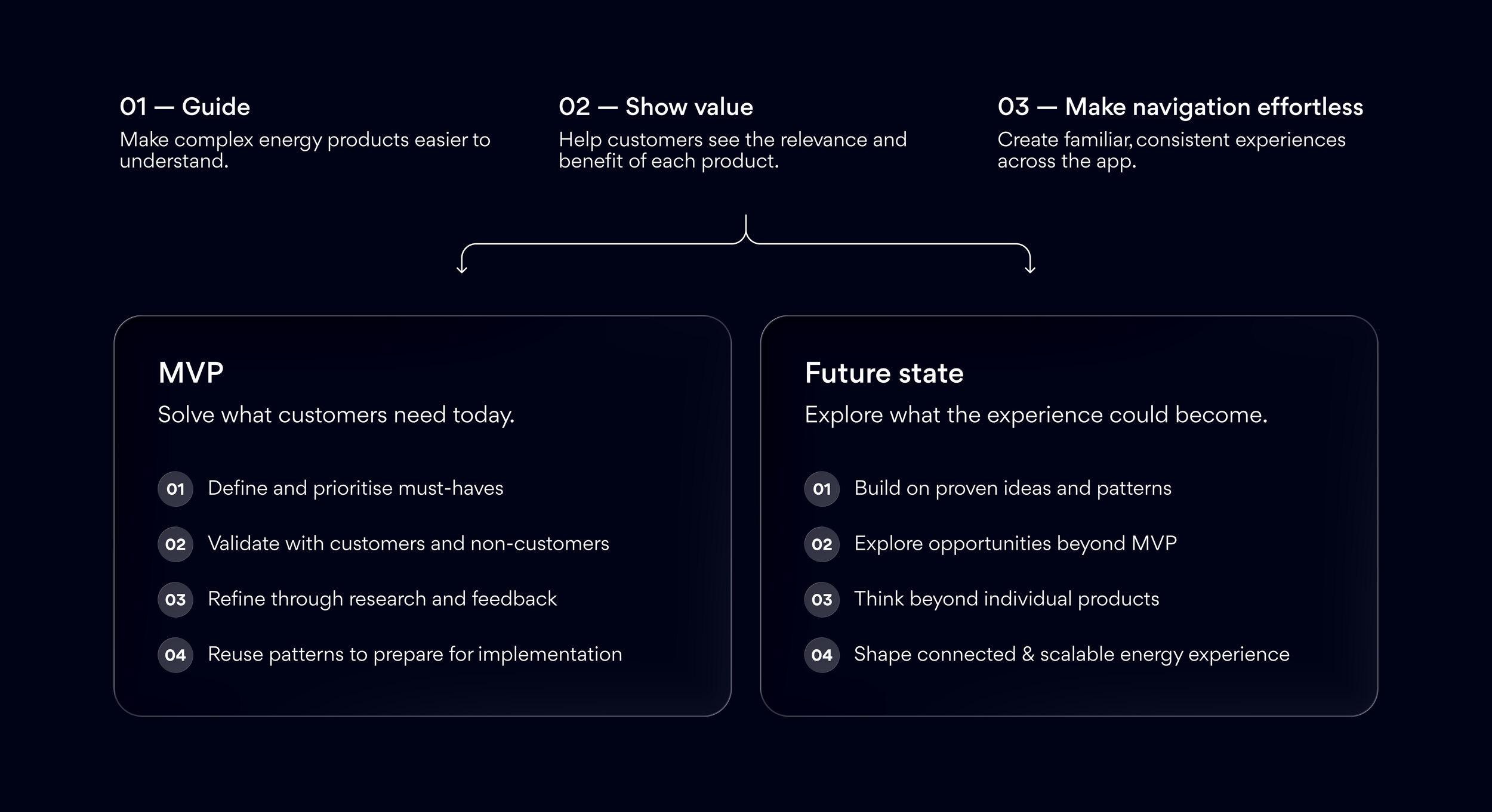
The challenge was to balance two priorities:
MVP: Bring new products to market with clear, useful customer journeys.
Future state: Establish principles and reusable patterns that could scale as the portfolio evolved.
For today and tomorrow
Each MVP was an opportunity to solve an immediate customer need while establishing patterns that could support future products.
I explored how shared experiences could help customers understand their products, recognise their value and navigate the app more easily as Origin's portfolio grew. Three principles guide this.
01 — Guide
Help customers discover what's relevant to them
As energy products and features become more complex, customers need useful information to be easy to discover without having to search for it.
I explored ways to introduce guidance, education and relevant information within the everyday experience, helping customers understand what matters to them and get the most from their plans.
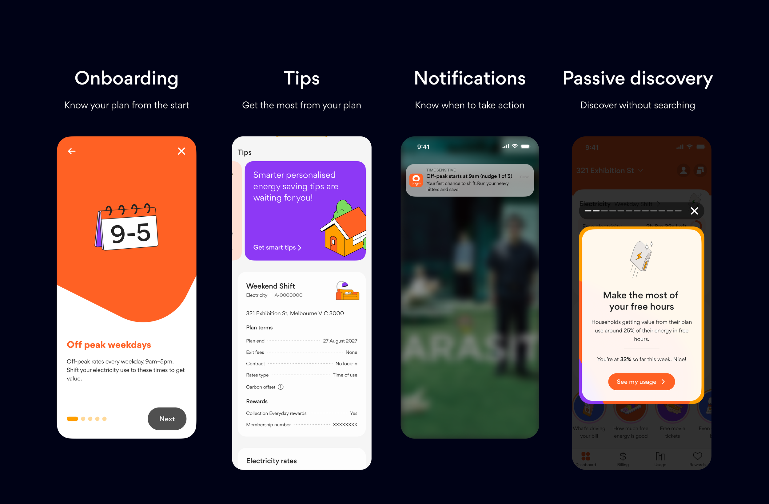
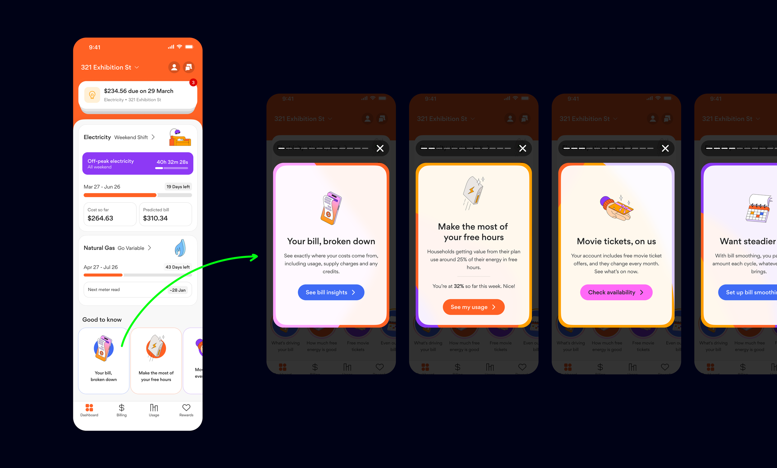
Principle 1 showcase / Discovery Reel
I explored a passive guidance layer inspired by social media stories, creating an opportunity to surface relevant tips, product information and savings opportunities within the app experience.
The concept was designed to help customers discover useful information rather than relying on them to actively seek it out.
Customer testing explored how people understood and interacted with the Reel, including what would motivate them to open it
The findings helped validate the concept's potential and highlighted the importance of making the content relevant and valuable to customers.
4.1/5 rated ease of viewing reels
4.4/5 rated ease of moving between reels
4.08/5 saving money was the strongest motivation for opening the Reel
Across the concepts, customers consistently connected value back to one thing: spending less.
02 — Show value
Help customers understand what's in it for them
Customers need to quickly understand why a product is relevant to them. I focused on making value more visible within the experience — particularly around the moments where customers were evaluating, comparing or taking action. Rather than asking customers to work out the value themselves, the experience should demonstrate it as simply as possible. Just tell them, don’t hide in complex data.
Principle 2 showcase / Dedicated plan page
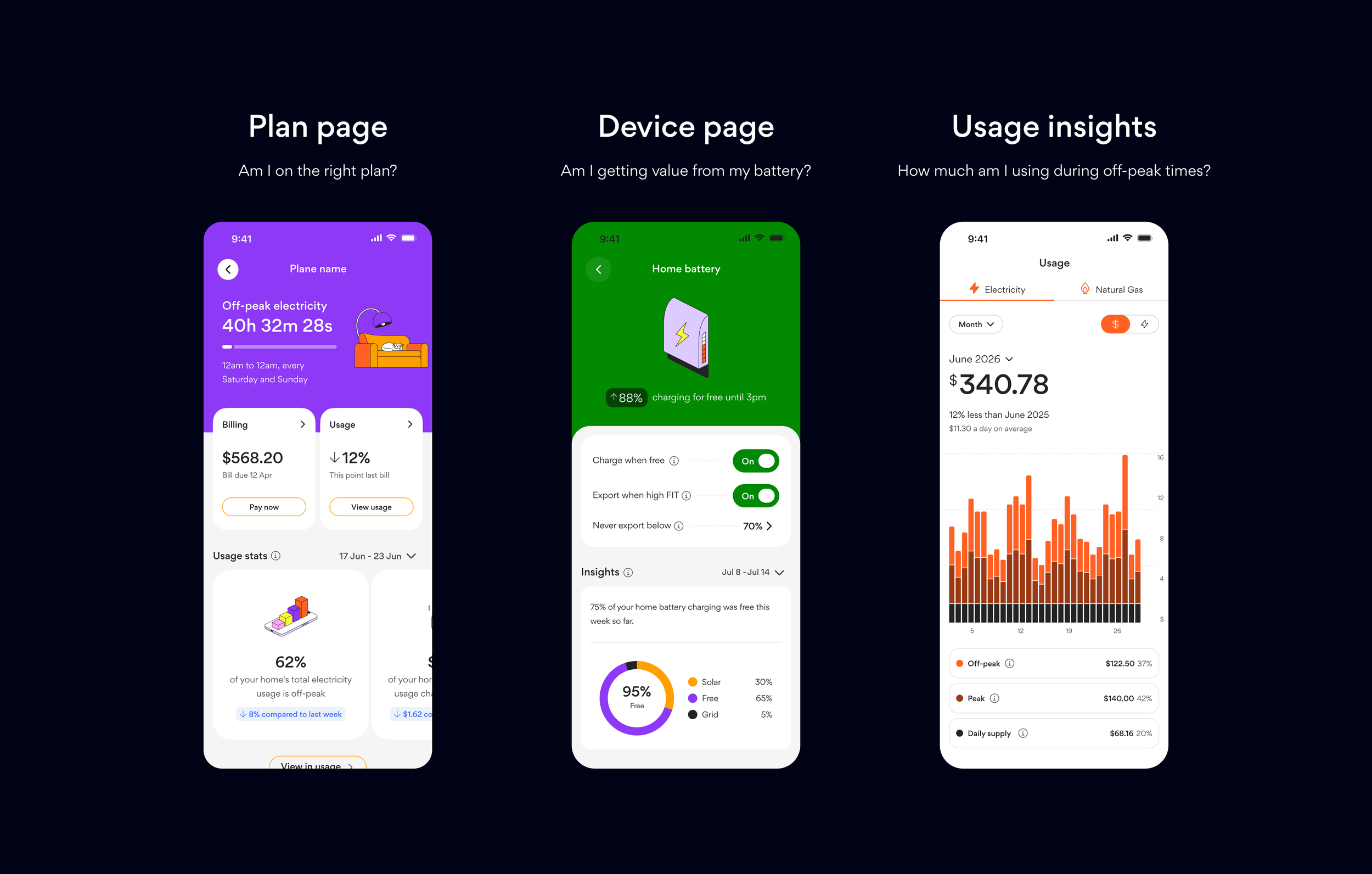
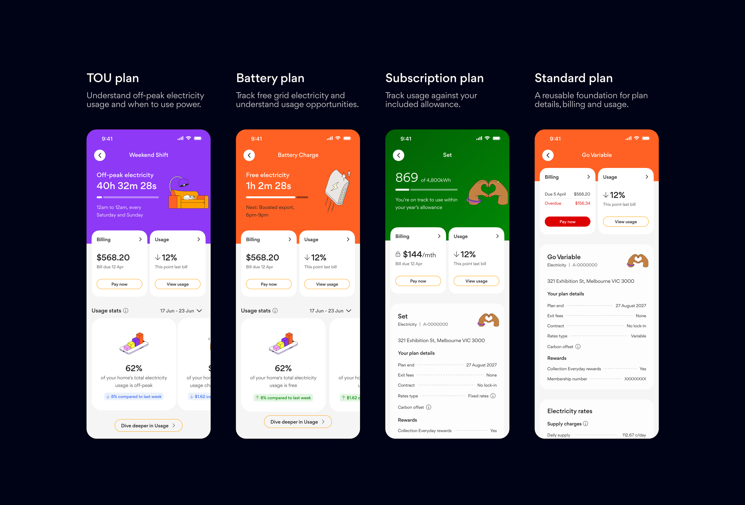
Making product value visible at a glance. Different energy products have different propositions and measures of value. I explored a scalable and consistent plan-page model that brings relevant information into one place, replacing fragmented information across the app with a more holistic view of each plan and the value it provides.
Across several rounds of testing, we explored how customers navigated, understood and valued this broader service experience. It showed bringing information together was valuable — but that customers wanted information to feel personally relevant and clearly connected to value.
92% preferred the consolidated plan experience
4.55/5 found having plan information in one place useful
4.63/5 highest-rated content type: personalised usage insights
Easy to understand — a recurring reason customers preferred this experience over their current one.
03 — Make navigation effortless
Helping customers find the right information and take action
As more products and capabilities were introduced, the app needed a clearer way to connect customers with the information and tasks relevant to each service.
Showcase / Connecting dashboard widgets to plan pages
I hypothesised that customers tap service widgets for different reasons, depending on what they need to do — not just to check their bill.
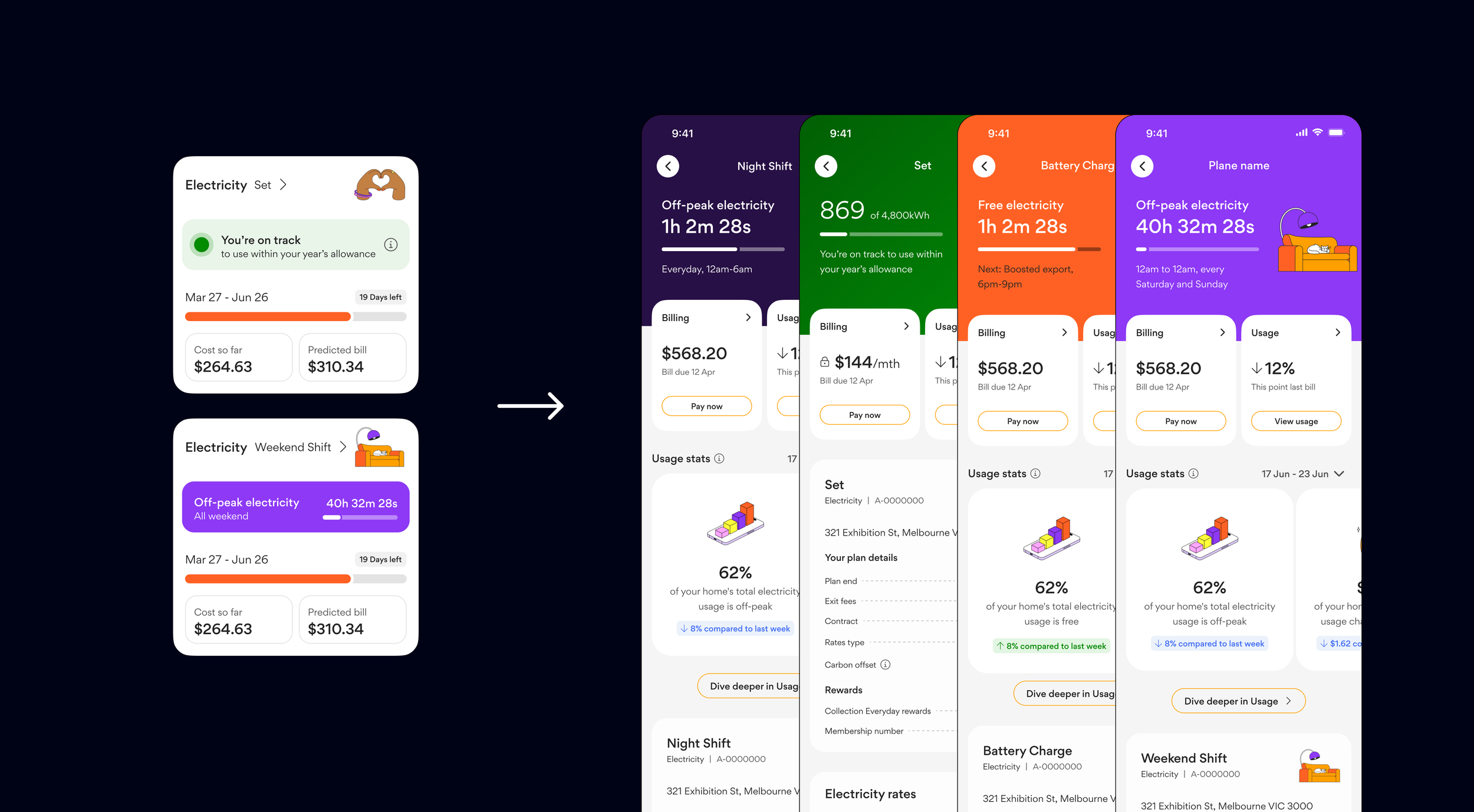
Customer testing helped validate my recommendation to link service widgets to dedicated plan pages rather than sending customers straight to Billing. This would give customers a more relevant starting point for their needs. For example, a customer wanting to order more bottled gas could tap the bottled gas widget and find the order function on their plan page.
This also created an opportunity for widgets to evolve beyond billing information, offering a useful snapshot of each plan and a preview of the features and actions available within it.
Navigation testing explored where customers expected to go when completing service-related tasks.
64.6% tapped the service widget first across eight non-billing tasks, despite other navigation options being available.
84% made a correct first tap.
Customers could still find their way When the widget wasn't the first choice, most participants still reached the correct destination through the main navigation.
Overall takeaway
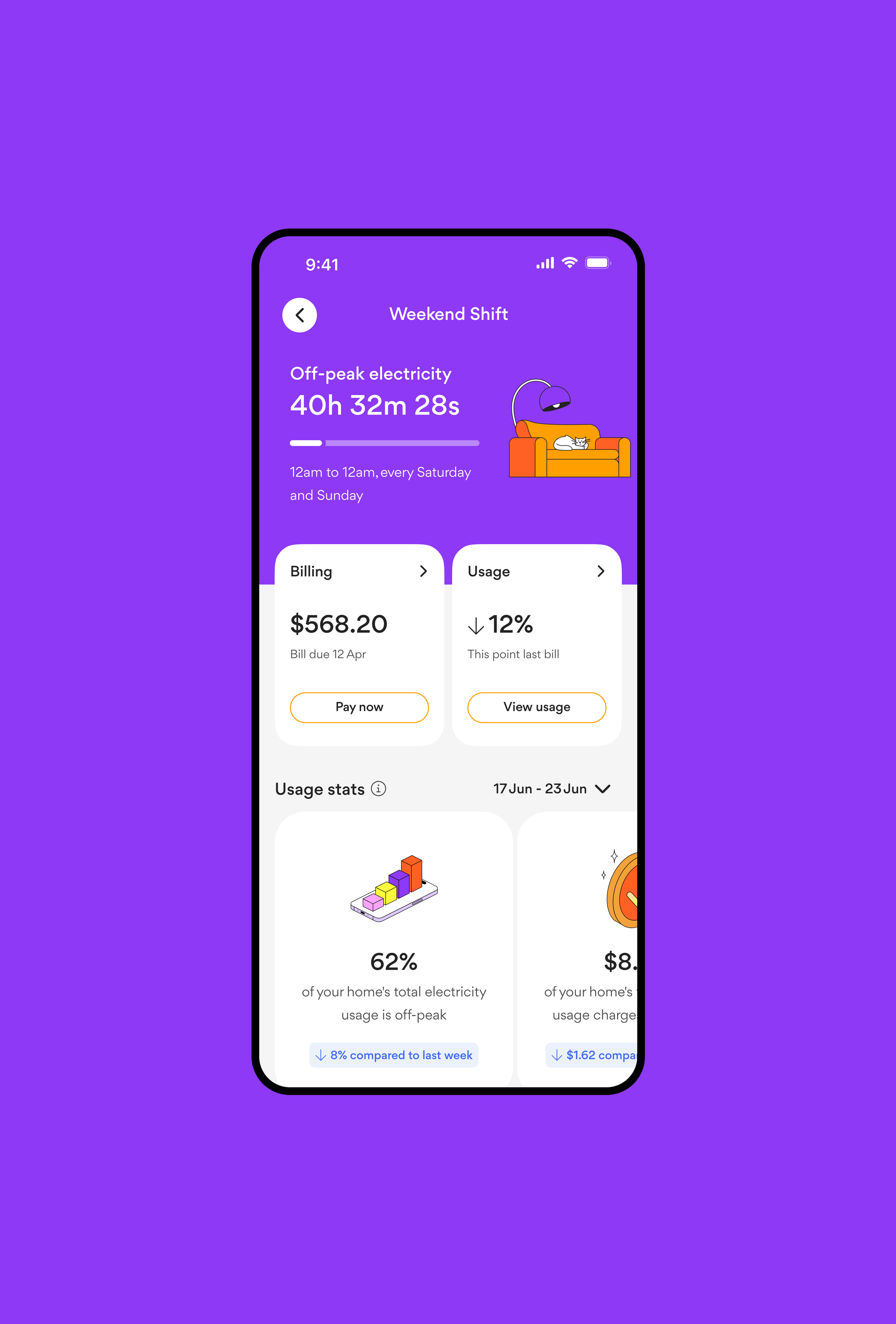
This work established the direction for how Origin's app will evolve alongside its growing energy portfolio. By combining immediate product needs with reusable patterns and validated future-state concepts, I explored how the app could make products easier to understand, surface relevant value and create more consistent customer journeys.
The high-fidelity designs provided a tangible starting point for feature teams to refine and develop when prioritised, helping connect near-term product delivery with a broader vision for the app.

Genesis website
Origin App

Mercury website
Genesis app
Mercury app