
Genesis App
Following the Genesis website transformation, I continued working on the app, focusing on making it simpler and more consistent.
As we updated existing and developed new features, we looked for ways to improve customer journeys, update the UI and create reusable components. This helped us improve the app while building a stronger foundation for future development.
MY ROLE
I led UX and UI design across app features and customer journeys, working closely with the Product Owner, Business Analyst and development team to balance customer needs, product priorities and technical constraints.
My work spanned journey design, prototyping, customer testing, visual design and the development of reusable components and patterns.
MY CONTRIBUTION
UX strategy
Discovery
Prototyping
High-fidelity design
Design system
User testing
Stakeholder collaboration
Developer handoff & QA
PROJECT SCOPE
Mobile apps
Customer journeys
Self-service
UI modernisation
Reusable components
Design system
Customer testing

The challenge
The app had evolved over time, leaving inconsistent interfaces and fragmented design patterns. There were opportunities to simplify customer journeys, improve self-service and create a more cohesive experience across the app.
However, a full redesign wasn't practical alongside the ongoing delivery of new features and improvements.
When working on existing and new features, we considered the extent of the changes, the importance of the journey and the effort required to deliver them. Where a substantial part of an experience was changing, or a feature was particularly important, we looked for opportunities to introduce more significant UI improvements. For smaller changes, we focused on what was necessary.
This allowed us to improve the app progressively, integrating better design into the work already underway.

Improving experiences through project work
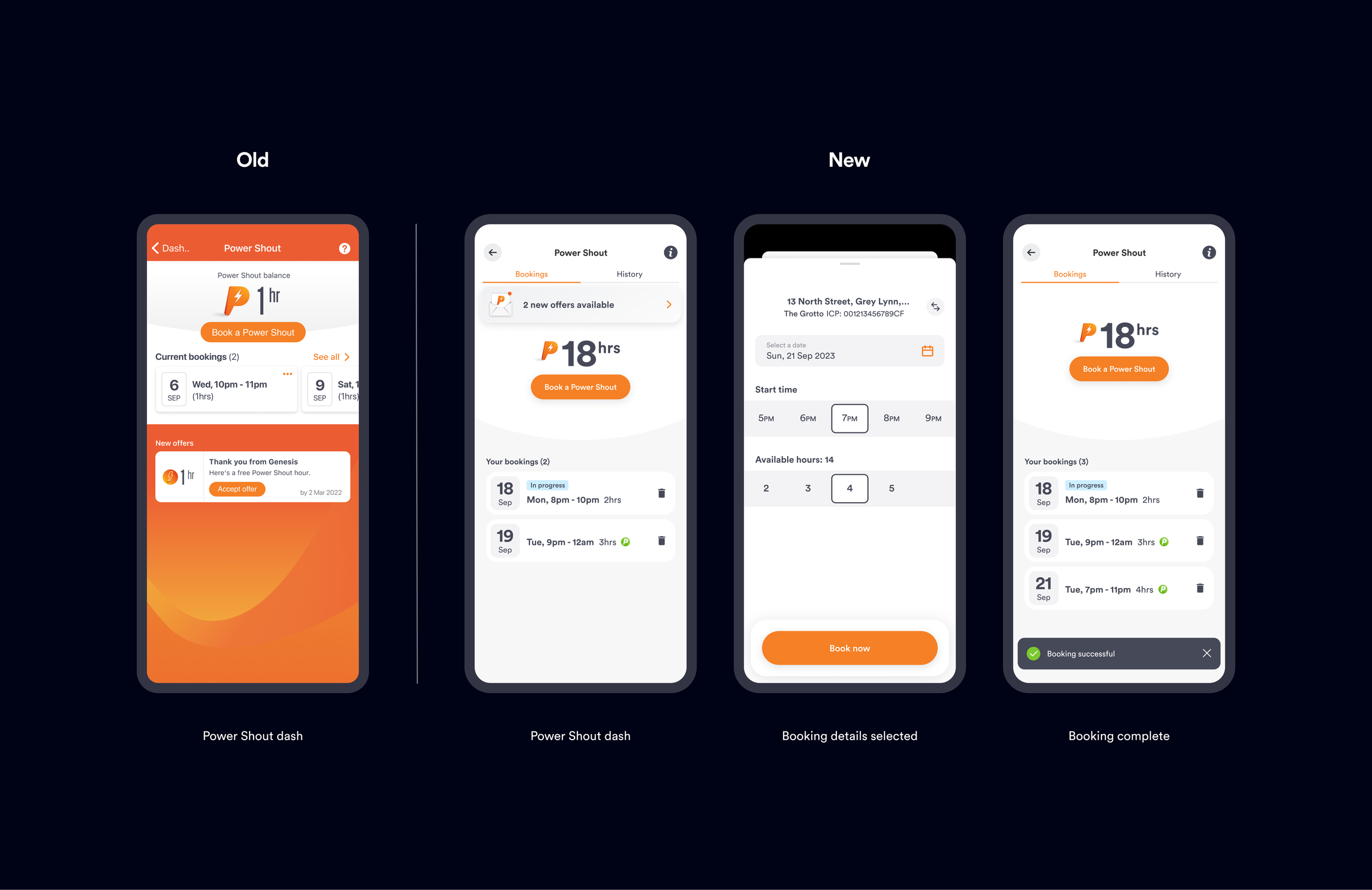
01 — Power Shout: simplifying the booking experience
Power Shout is a key Genesis proposition that lets customers earn and use free power. The booking experience needed to make it easier for customers to book their free power hours, see upcoming bookings and understand when hours fell within “green times”.
I worked collaboratively with the team to shape a clearer booking journey, using prototypes and customer testing to validate design decisions and identify opportunities to reduce friction.
The project also provided an opportunity to simplify and improve the underlying UI, while considering how components could be reused beyond the immediate feature.
85%
Rated the new Power Shout booking experience as easy or very easy.
43 mil+
Power Shout hours have been used.
180,000+
Genesis customers have enjoyed Power Shout.
“I just think you guys have made it way easier, clearer and smoother. Super intuitive, what's not to love.”
— Ria Peters, Product Owner, Power Shout


The app had fallen behind in supporting essential account management tasks, with earlier priorities pushing some self-service capabilities down the roadmap. As a result, customers still needed to contact the contact centre to make basic account changes.
Following a major organisational restructure, much of the planned work across the business was put on hold. We used the opportunity to take a pragmatic approach, prioritising important improvements that had previously been deferred.
The focus was on bringing these tasks into the app while creating a more consistent, scalable approach to account management.
I designed reusable patterns across profile management, establishing a consistent experience across screens and fields while allowing for the specific logic and requirements of each field. This meant we could design the experience once and apply it across multiple tasks, rather than creating a different solution for each one.
This established a more consistent, scalable foundation for self-service as the app continued to evolve.
Other projects and ongoing improvements
Alongside these projects, I worked across a broader range of features and customer journeys. Each presented a different opportunity to improve the experience, support new capabilities or establish foundations for future development.
Add products — Information architecture
As Genesis expanded its offering, I refined the app's information architecture through rounds of customer testing to accommodate additional products and services while keeping the experience clear and easy to navigate.
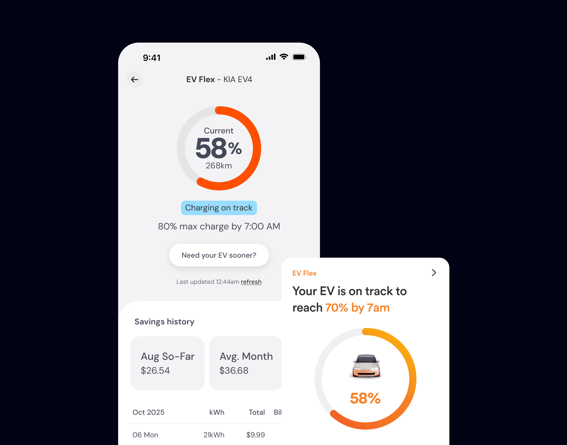
EV Flex — New feature
I designed the end-to-end UX and UI for a new smart charging feature, working with the team to size development stories and prepare the experience for development before leaving Genesis to pursue opportunities in Australia.
Since I left Genesis, the company has undergone a rebrand, and EV Flex has been used as a showcase for the app's refreshed visual identity.
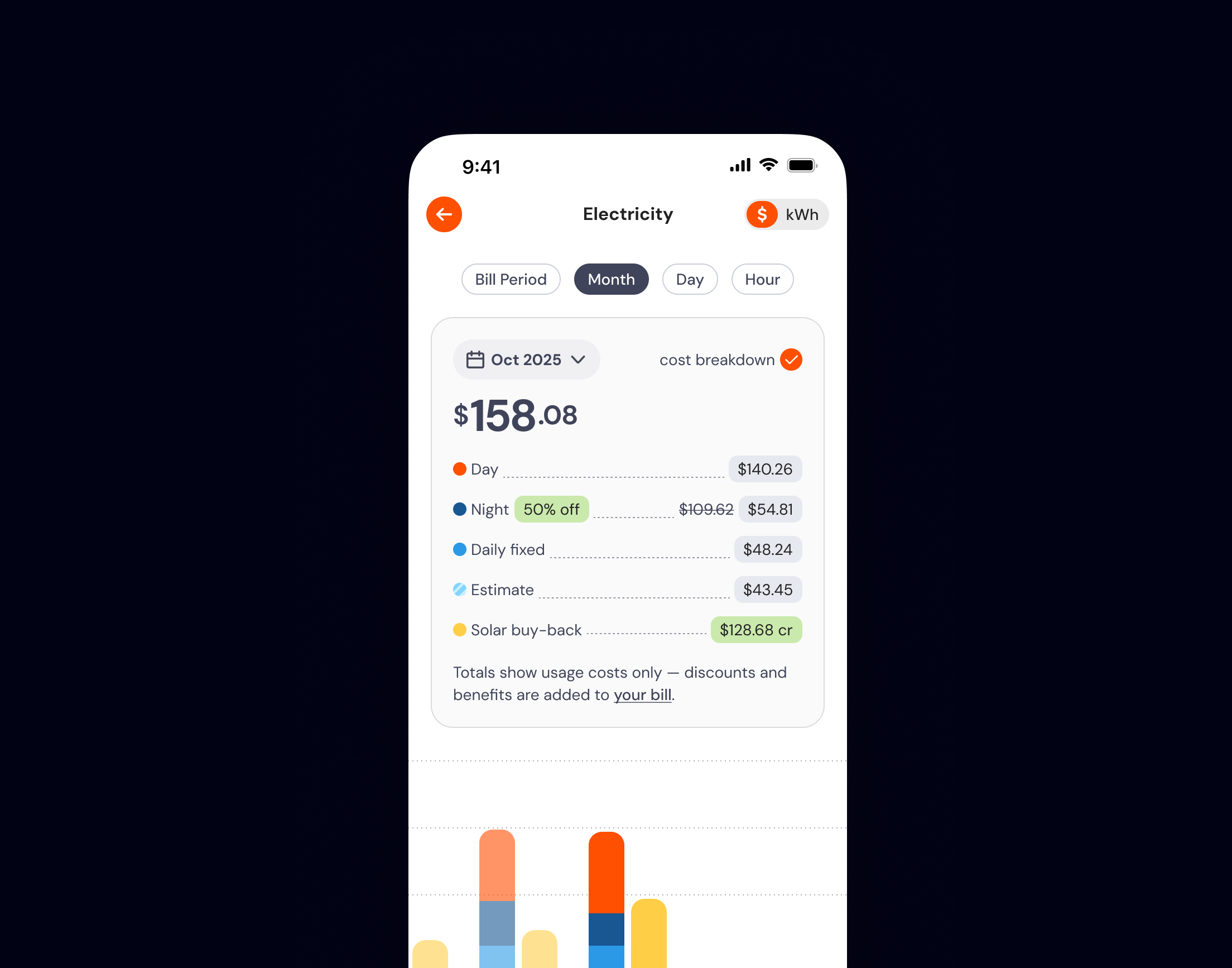
Auto-pay — Customer journey refresh
We refreshed the auto-pay customer journey, using the substantial scope of the changes as an opportunity to align the experience with the refreshed UI and introduce reusable components.
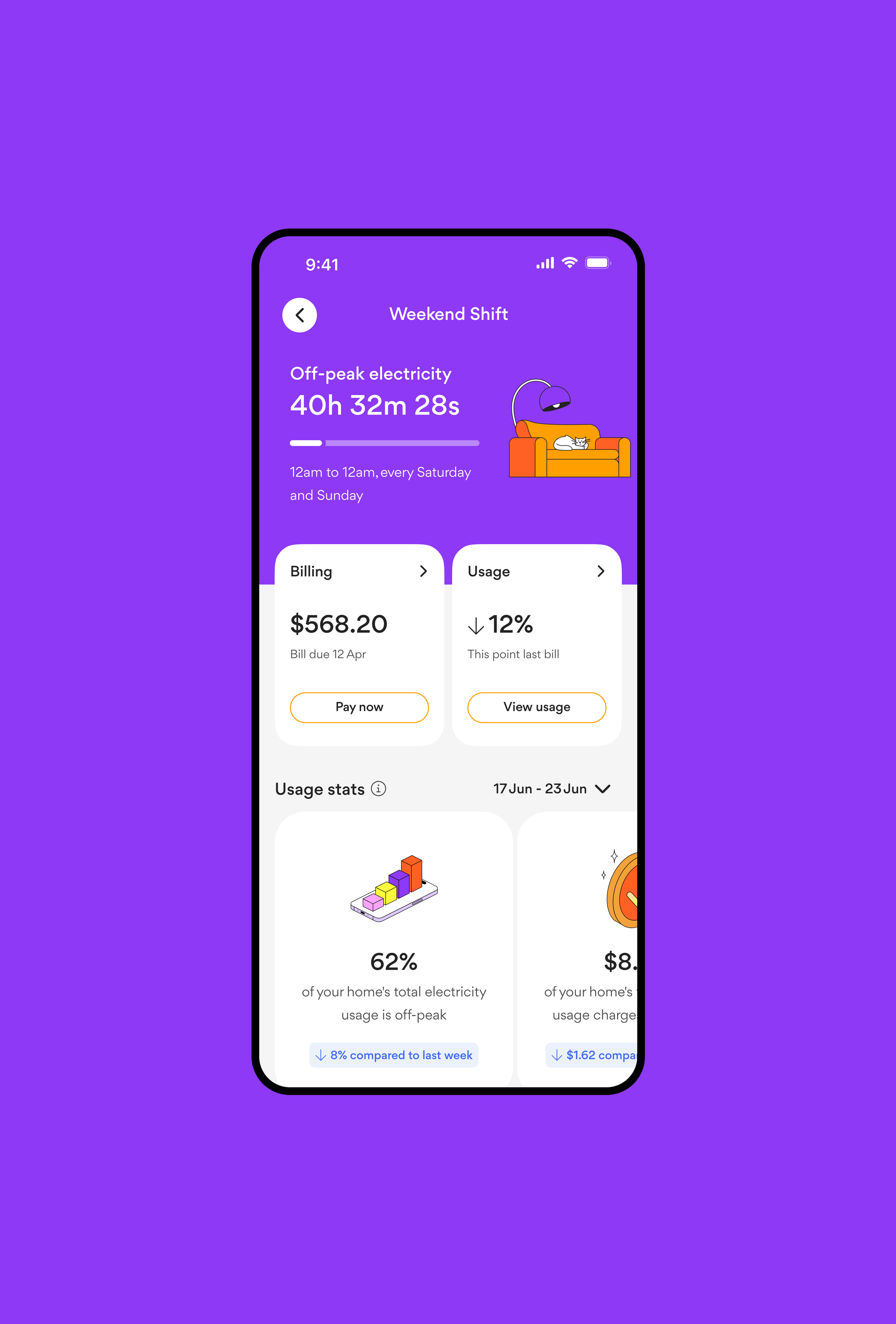
Usage and time-of-use — Early concept exploration
An area I'm particularly passionate about, I began exploring how customer usage information could support future time-of-use experiences and new energy products, including more contextual, personalised usage insights.
The work was still at the concept stage when I left Genesis, establishing a foundation for further exploration and development.
A more consistent app, built incrementally
What ties this work together is a shift from fragmented, one-off solutions to a more strategic, system-led approach. By focusing on self-service, simplification and consistency, I helped improve customer journeys while establishing stronger foundations for future development.
Rather than redesigning everything at once, we used individual projects as opportunities to address customer needs and progressively improve the app. This pragmatic approach balanced immediate priorities with the longer-term goal of a more consistent, connected experience.

Genesis website
Origin App

Mercury website
Genesis app
Mercury app